This post was originally published on 12/7/2010.
At Skritter, we've been experimenting with email campaigns as a marketing tool. Specifically, we wanted to see if opt-in email marketing to customers that were trying the software was an effective way to boost engagement and sales. To do this, we set up four experimental groups and began sending out some short "how to use Skritter" emails (more on the results of that effort in another blog post). In the course of testing the emails, we needed to randomly show a check box field on our signup page that allowed customers to opt in/out of the emails. Initially we used the A/B test purely for the sake of helping us with the experimental design of the test, but what we found was interesting in its own right.
Two Designs
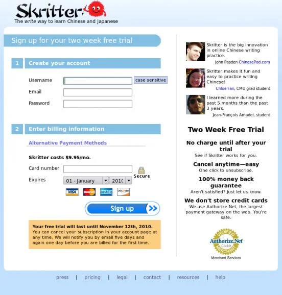
Here are the two signup page designs:
The control design.
The variant design.
The Result
I'll save you the effort of comparing the two: the only difference is the check box above the "Sign up" button. Surprisingly, adding that field to receive emails was surprisingly effective at deterring signups. After only a short period of time we were able to determine with 94% confidence that the variant was performing worse, to the tune of a 17% decline.
We hadn't expected that tiny email option to have such a large impact on sign ups! Lesson learned: never, under any circumstances, modify the appearance or function of a mission-critical part of your website without testing. That simple test helped us avoid a 17% decline in sign ups every month.


